How to read advanced charts
Learn how to read financial charts in part three of our guide to Advanced Trading, tools and terminology to help you take control of your trades.
In the first two chapters of this series, we walked you through the order book and broke down the basic order types. Now that you understand the basic mechanics of Coinbase’s Advanced Trading tools, we’re going to dive into some of the charts you’ll have access to — which offer a wealth of data and historical information you can use to make better-informed trading decisions.
Coinbase is currently rolling out a suite of Advanced Trading tools, so in this series we’re breaking down some of the functions and terminology you’ll encounter. Much of this information isn’t specific to Coinbase or even crypto, making it useful to learn if you have any interest in markets and trading. We also have a new video series that covers this material in more detail and illustrates exactly how these new tools, charts, and features work if you’re using the Coinbase app or Coinbase.com.
How to read candlesticks
Before we get into the more complex data visualizations, we’re going to take a step back and run through a quick primer on reading candlestick charts — which are probably the most common type of financial chart you’ll encounter whether you’re trading crypto, stocks, commodities, or any other asset class.
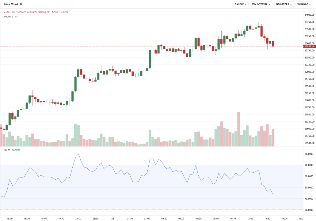
Here’s an example of an actual BTC-USD candlestick chart from Coinbase’s Advanced Trading interface:

Candlesticks give you an instant snapshot of whether a market’s price movement was positive or negative, and to what degree. The timeframe represented in a candlestick chart can be selected by the user — ranging from one minute to one day. (Also worth noting: unlike stock markets, crypto markets never close. So the “open” and “close” prices are the prices at the beginning and end of the selected timeframe.)

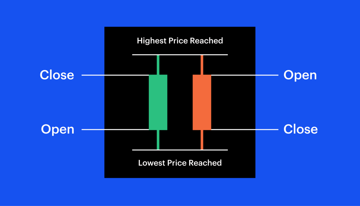
Like more familiar line and bar graphs, candlestick charts show time across the horizontal axis, and price data on the vertical axis. But unlike simpler graphs, candlesticks have more information. In one glance, you can see the highest and lowest price that an asset hit during a given timeframe — as well as its opening and closing prices. Here’s a simplified example to help you see how they work:
Each candle is made up of a body and a wick. The body of the candle tells you what the open and close prices were during the candle’s time frame.
Green candles show prices going up, so the open is at the bottom of the body and the close is at the top.
Red candles show prices declining, so the open is at the top of the body and the close is at the bottom.
The lines stretching from the top and bottom of the body are the wicks. These represent the highest and lowest prices the asset hit during the trading frame.
Now that you understand candlesticks we can dive into some of the complex types of data visualizations that are useful if you’re interested in a trading strategy called technical analysis. Technical analysis involves studying historical data to try to make informed decisions about where the market might be going. Coinbase’s advanced trading view gives you access to a wide range of charts and indicators you can use to inform your trading strategy.
Advanced charts and indicators can take you behind the scenes of each trading pair and help you better understand past price movement. Traders use this information to spot trends and form an opinion on future opportunities. We’re going to look at four commonly used ones:
Relative Strength Index (RSI)
Simple Moving Average (SMA)
Exponential Moving Average (EMA)
Moving Average Convergence Divergence (MACD)
One important note before we get started: past performance can't predict the future. While each chart and indicator may help you view the crypto market from a different angle, most experienced traders use multiple indicators to get a better understanding of the market.
Relative Strength Index (RSI)
One of the most common charting indicators in a traders’ toolbox is the Relative Strength Index, or RSI. The RSI measures the strength of an asset’s upward and downward price movement over a period of time. You can think of the RSI as a clue about how intensely the market has wanted to buy or sell a specific asset over a period of time.
Let’s take a look at a screenshot from Coinbase’s Advanced Trading interface — showing Bitcoin priced in U.S. dollars (USD), or “BTC-USD.”

At the top of the screen is a candlestick chart showing the range of daily BTC prices over the course of 2021. You can choose a variety of price visualizations, timeframes, and charting indicators you want to see via the fields in the top right of the price chart.
If you choose the Relative Strength Index, the blue RSI line chart appears below the candlestick price chart. As you can see, the blue RSI line oscillates between a value of 0 and 100. It’s calculated by dividing an asset’s average gains by its average losses over a selected timeframe.
In the example above, the range is set to 10 days — so we’re seeing BTC’s relative strength as calculated by dividing the average gains by the average losses over the past 10 days.
With this formula, the RSI will always be a number between 0 and 100. If that sounds complicated, don’t worry — the chart does the calculations for you. The main thing many traders look for is when the RSI jumps above 70 or below 30.
A RSI higher than 70 is often thought to signal that an asset might be overbought — and can indicate that the price’s upward momentum might be slowing. And an RSI under 30 is often thought to signal that an asset might be oversold and its downward momentum might be slowing.
It’s important to know that overbought doesn’t necessarily mean it’s time to sell and oversold doesn't necessarily mean it's time to buy. All it means is that according to this one index, BTC’s momentum up or down might be slowing — and might even be due for a reversal.
Remember that advanced traders rarely ever rely on one indicator. They typically combine multiple indicators in their analysis — including moving average indicators. So let’s look at those next.
Simple Moving Average (SMA)
The Simple Moving Average indicator (commonly referred to as SMA) shows you the average price of an asset over a period of time — which can help you understand an asset's overall price movement.

If the SMA is set to 50 days, the first point on the graph will be an average of the prices from each of the last 50 days. Here’s a screenshot of the BTC-USD price chart using a 50-day SMA — the SMA is the the blue line overlaid on the candlestick chart.
Some traders see an upward-sloping SMA trend and anticipate further gains in price.
If the price (indicated by the candlesticks) dips below the SMA trend line, this might be interpreted as a sign that the upward price trend may be reversing.
Exponential Moving Average (EMA)
An alternative to the Simple Moving Average is the Exponential Moving Average (EMA), which is usually better for identifying short-term trends. Like the SMA, the EMA shows you the average price of an asset over a period of days — but the EMA puts more weight on the most recent days.
This means the EMA will both respond more quickly to new price movements and fluctuate more than the SMA — which is why the EMA may be better suited to quickly identifying a new shift in price. In the event of a significant price reversal, the EMA will slope sharply upward or downward more quickly than the SMA would.
Here’s is a 50-day EMA line chart (in purple), overlaid across the BTC-USD candlestick chart:

There are a lot of ways to interpret the EMA, but some traders look for moments the trend line begins to shift upward after a long downtrend — this may signal a bullish reversal.
Moving Average Convergence Divergence (MACD)
The Moving Average Convergence Divergence (or MACD) indicator is calculated by subtracting the 26-day EMA from the 12-day EMA.
The most important thing to remember is that the MACD line appears in relation to another line called the signal line. The signal line is the 9-day EMA, which is a useful baseline for comparison, because it reacts more slowly to price changes. The red and green graph that looks sort of like a mountain range is called the MACD histogram — more on that in a moment.

By watching how the MACD line moves in relation to the signal line, you can get a sense about the direction and strength of price movements. The “convergence” and “divergence” in the MACD’s name gives you a clue about what to look for: moments when the MACD moves closer to or further away from the signal line.
When the MACD line crosses the signal line moving down, it could signal a bearish trend.
When the MACD crosses the signal line moving up, it might signal a bullish trend.
The bigger the gap between the two lines, the stronger the signal.
This is where the Histogram is most useful. Histograms measure the strength of the signal — by showing the distance between the MACD and signal line.
Advanced trading indicators might seem overwhelming at first, but you’ll get better at reading them the more you use them — and eventually you’ll be able to scan a screen (or screens!) packed with charts and indicators. You’ll be comparing signals, deciding which to follow, and feeling more confident about pressing the buy or sell button.
And always remember, no one chart tells the complete story, which is why most experienced trader’s strategies take multiple charts and indicators into account.
Disclosure
Coinbase offers simple and advanced trading. Advanced trading is for experienced traders and is subject to the Trading Rules. Fees on the two platforms vary. Content is for informational purposes and is not investment advice. Investing in crypto comes with risk.


